Building InvolveMe
This project, including this writeup, was a combined effort between Celine Lee, Bruce Zhang, Stanley Ren, and myself.
Whether you’re moving to a new city or trying to change up your daily routine, volunteering is a great way to meet new people, build new skills, and engage with the community around you. However, trying to find the right place to volunteer is tough, and all the scattered information across the internet and bulletin boards can be overwhelming. To solve this, InvolveMe is an app that effortlessly connects you to organizations and other fellow volunteers, making volunteering more fun and social." —from the InvolveMe promo video
As described in the video, InvolveMe fills the communication gap between aspiring volunteers (possibly like yourself!), other fellow volunteers, and organizations. We felt that younger demographics, such as students in high school or post-secondary, enjoy being social and engaging in activities that broaden their experiences and skills. Volunteering is a prime example of these kinds of activities, but the difficulty in finding a volunteering role of interest is a big barrier to overcome. Having a platform that consolidates these opportunities while providing useful discovery features will reduce the friction to start volunteering, ultimately encouraging more youth to get involved. Our end goal is to make volunteering more social, connecting like minded people to make a bigger impact for the greater good.
Anticipated Users
We identified three main user groups for our app, and created personas to associate each of them.
Persona A: University Student
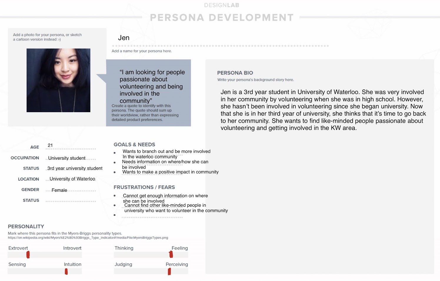
Being university students ourselves helps us understand the needs of others in this category; having moved to Waterloo for university from somewhere else, we all sought a sense of community, and felt that volunteering and getting involved was one of the best ways to do so.
Persona B: High School Student
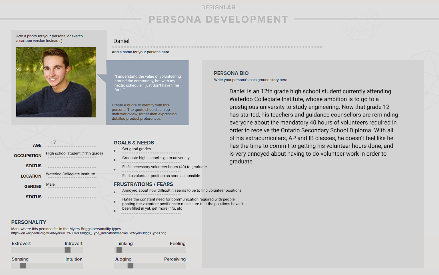
We chose to include this persona since in Ontario, high school students are required to fulfill 40 hours of volunteer work in order to earn their secondary school diploma. This app will be very helpful to them for finding a volunteering position in order to get certified or some other kind of acknowledgement.
Persona C: Outreach Coordinator for a local food bank
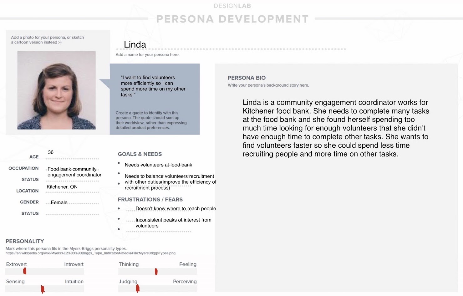
Organizations seeking volunteers often have employees working several duties; in this case, the outreach coordinator is responsible for not only recruiting volunteers, but may also be occupied with finding sponsors, marketing the food bank to donors, collaborating with supermarkets and schools, and so on. This persona embodies the non-technical user; that is, whereas an HR professional may be familiar with job board sites such as Indeed, a persona like this one probably would not.
User Interviews
To get a good sample of data, we aimed to interview an equal number of potential volunteers and organization members who are familiar with the recruiting process. With this in mind, we ended up interviewing 4 people:
- 4th year Health Studies student
- 4th year Computer Science student
- President and Personnel Manager at Waterloo Chamber Orchestra
- Director for Canadian Glass and Clay Gallery
For the students, we decided to ask a series of questions focused on the following three topics:
- Their interest with getting involved with the community
- Prior experiences with searching for volunteering roles
- Relation of volunteering work to their everyday life
For the coordinators, our questions focused on:
- Their role in the organization
- Value of volunteers
- Experience with their process of recruiting volunteers
Each one of these interviews provided very insightful findings. From interviews with students, there was a general consensus that volunteering grows both professional and soft skills. In addition, if the volunteering role is relevant enough, it can also serve as a great practical supplement to their area of study. For example, the Health Studies student said that her volunteering experience gave her a better view into the world of social health, an area she is very interested in. Another common theme was that current methods of finding volunteer jobs make the task difficult. Each student had a different source of information they sought from, but all said that the variety of jobs were lacking.
For volunteer coordinators, social media can be a good way to reach potential volunteers, as it is cheap and can reach a wide audience. However, it is difficult to target any particular audience for more specialized roles. Coordinators also said that their volunteers contribute to the organization’s image, so it is important to find people with matching values. In addition, social media is only a tool for outreach and not a comprehensive solution for recruiting volunteers, so another solution is needed to facilitate registration, making the process fairly complex.
Affinity Diagrams, Storyboarding, and Crazy 8s
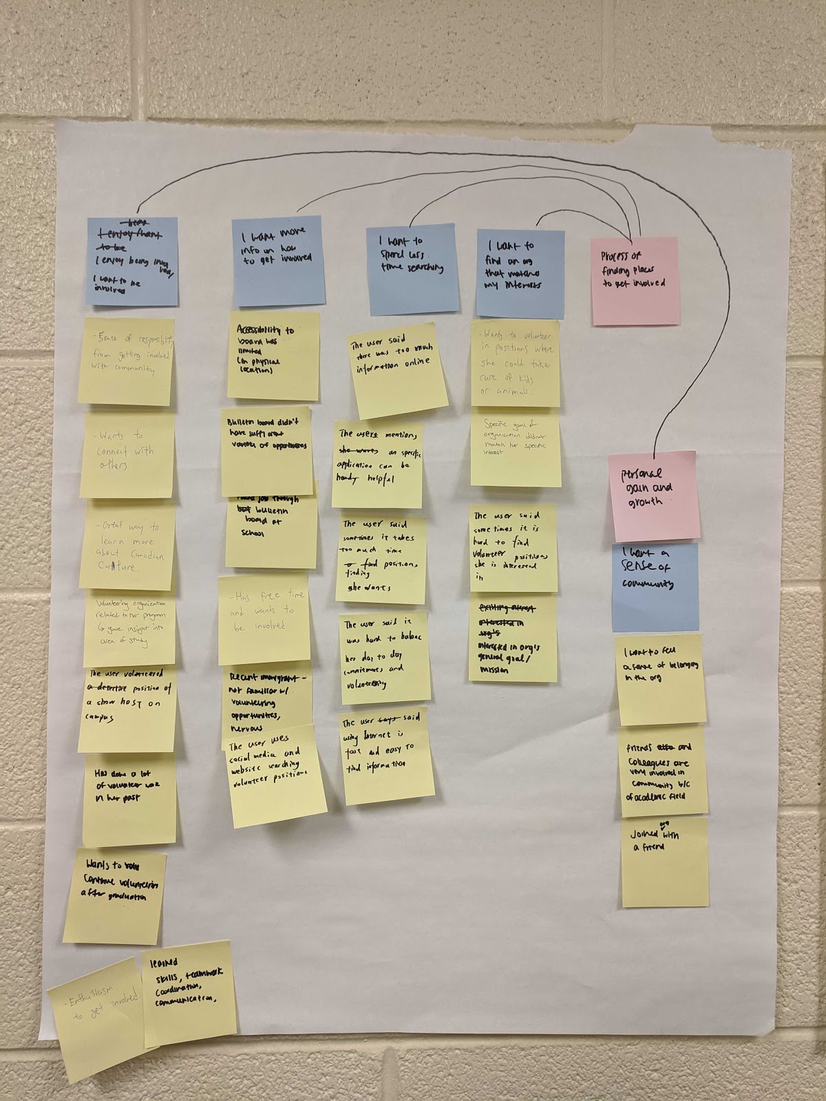
We used affinity diagrams to identify key issues amongst all our interviewees. Through this process, we found many issues relating to the search process of volunteer jobs. For example, many people wanted more info on how to get involved, find something that matches their interests, and spend less time searching.
Later on, we incorporated these themes into our storyboards, where we brainstormed different scenarios where people use our app. Some of our storyboards can be seen below.
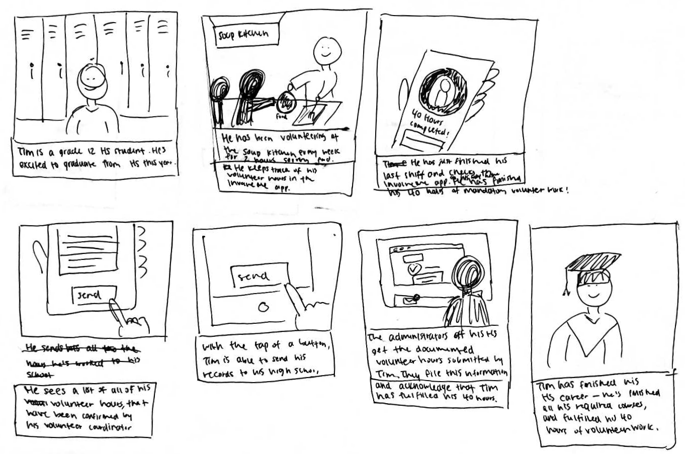
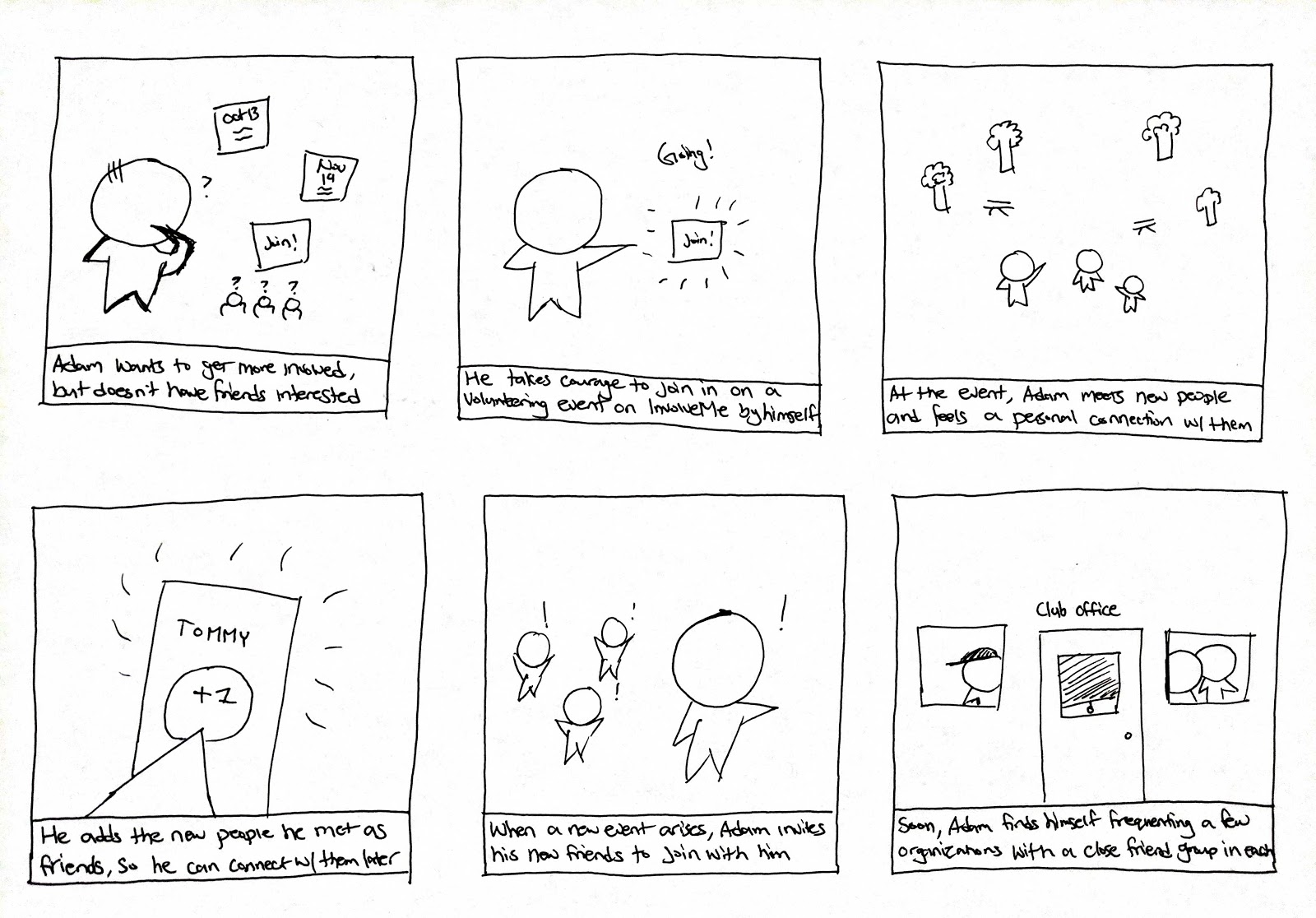
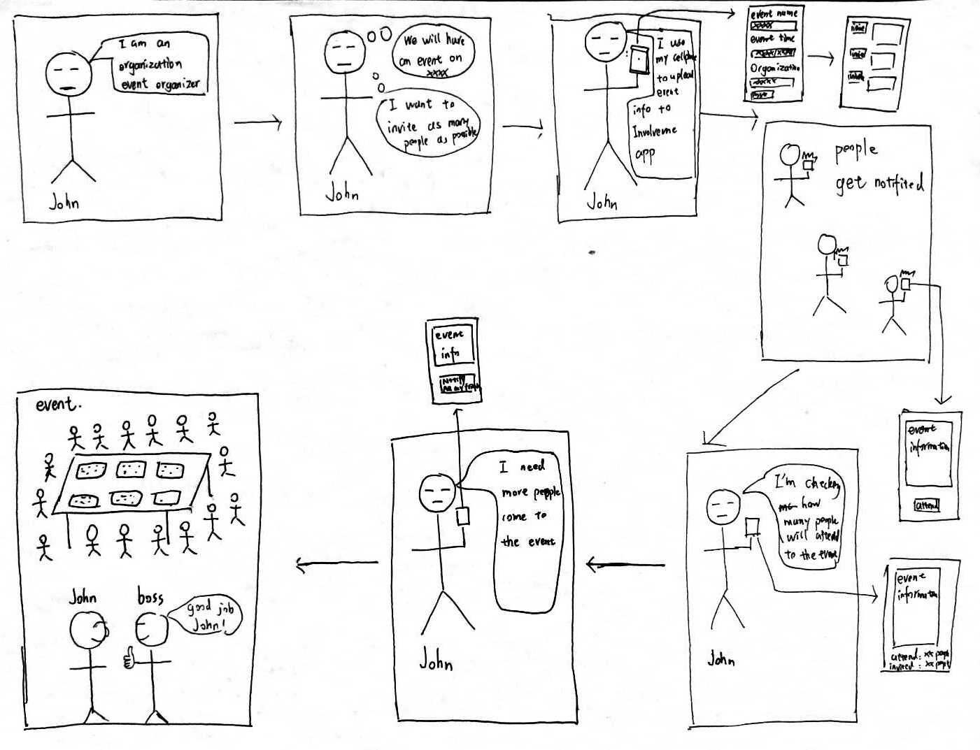
Envisioning these scenarios allowed us to better understand our use cases and identify key areas for our app to tackle.
- Help volunteers find jobs they are interested in, possibly to fulfill their volunteer hours.
- Provide more social features to connect users.
- Provide features to organizations that would let them recruit volunteers efficiently.
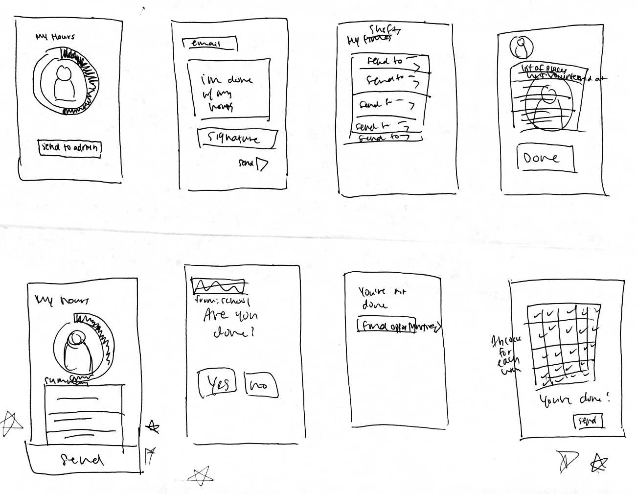
For each of these key features, we drew Crazy 8 diagrams to brainstorm possible UI designs.
Work Models
Work models are built to describe work from the point of the people interviewed. There were various models we could choose, but we opted to use the flow model and cultural model.
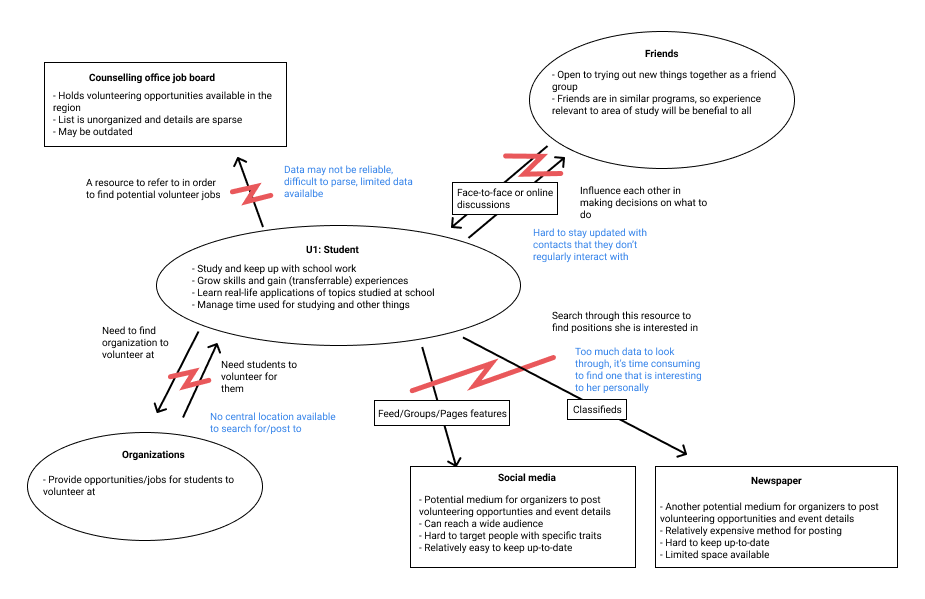
The flow model defines how work is broken up across people and how people coordinate to ensure the job gets done. The model could help us understand the current volunteering and recruiting process and identify areas of friction that can potentially be solved by our app.
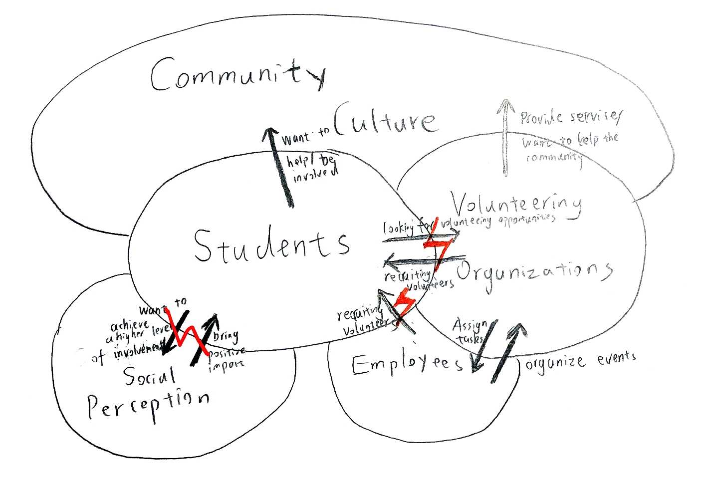
The cultural model represents the external influences that can affect a user's perception and adoption of the app. It also maps out how users may be connected socially, which is helpful for understanding how to better design our social features.
Initial Design Ideas
Based on the information we gathered from the user interviews we were able to gain a general understanding of what the users were looking for and their expectations for an engaging app. We then developed some initial sketches and wireframes of the application.
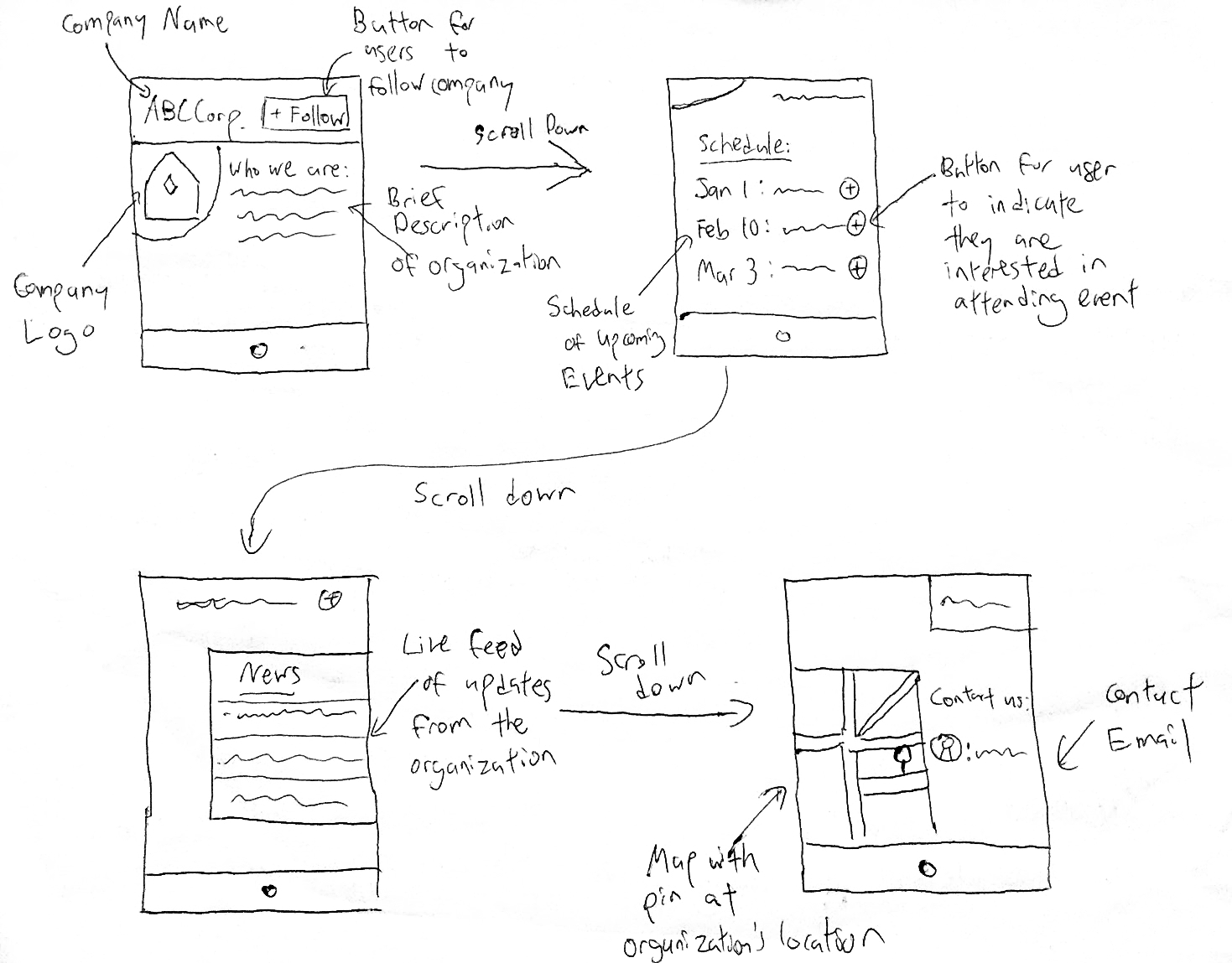
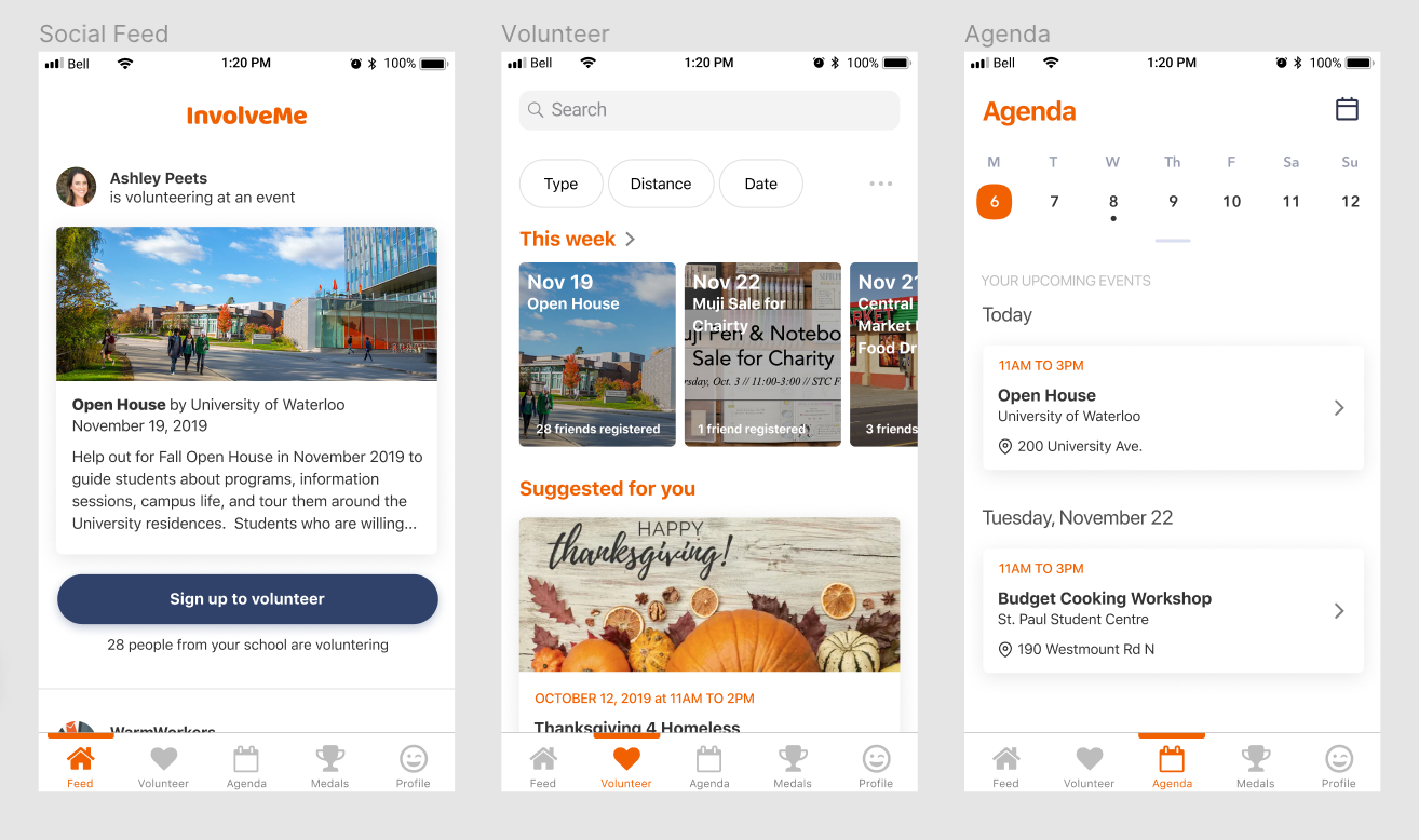
The organization profile page shows the organization’s name and logo. There is a follow button that the user can click to subscribe to updates (such as new events). The user can also scroll down to see a schedule of upcoming events that the organization is hosting, and other status updates. At the bottom, there is a map that shows the organization's address and contact information.
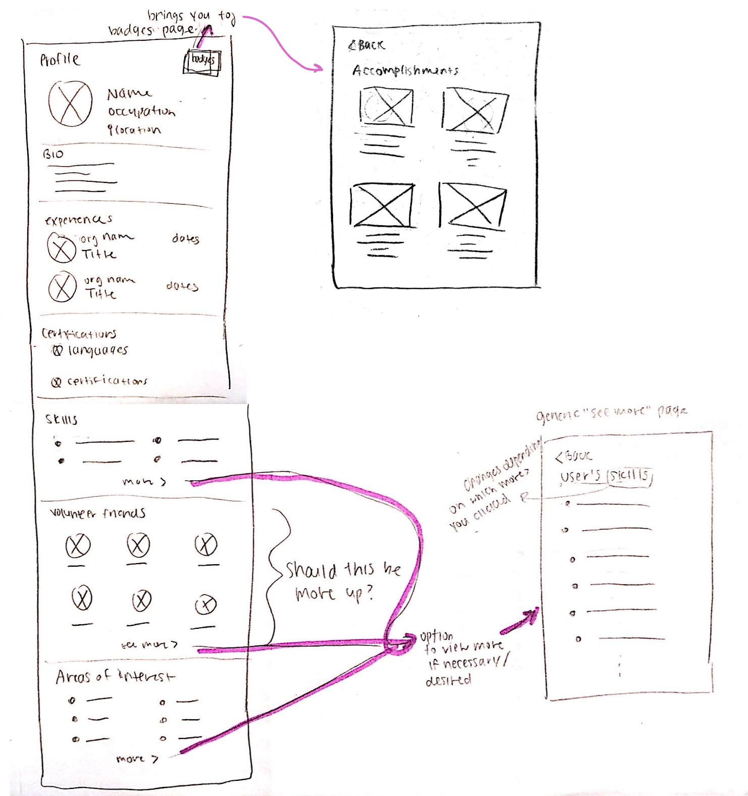
The user profile page similar to that of LinkedIn's, where volunteer recruiters are able to see a user's skills, bio, past experiences, accolades, and more. However, since volunteering is meant to be fun, we also added a button that would take you to your badges and accomplishments where you can keep track of how much you’ve contributed to your community.
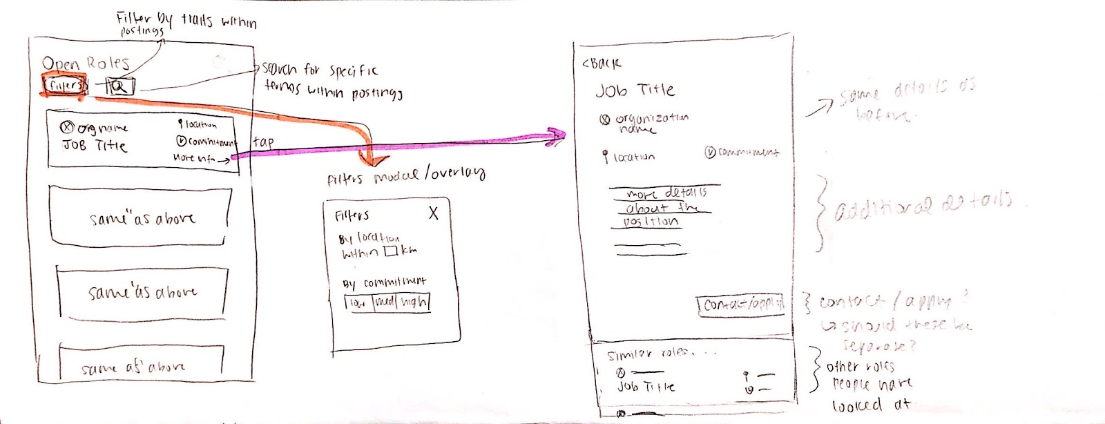
The volunteer role search page differs from the event search page, since here, users would be able to find a recurring volunteering role (rather than a one-off event). Designed for scannability, the list in the main view lists the role/job title, organization, level of commitment and distance, so that users are able to quickly see what kinds of volunteering roles are available. If a user is interested in a role, they could tap on the role to see more details about the position.
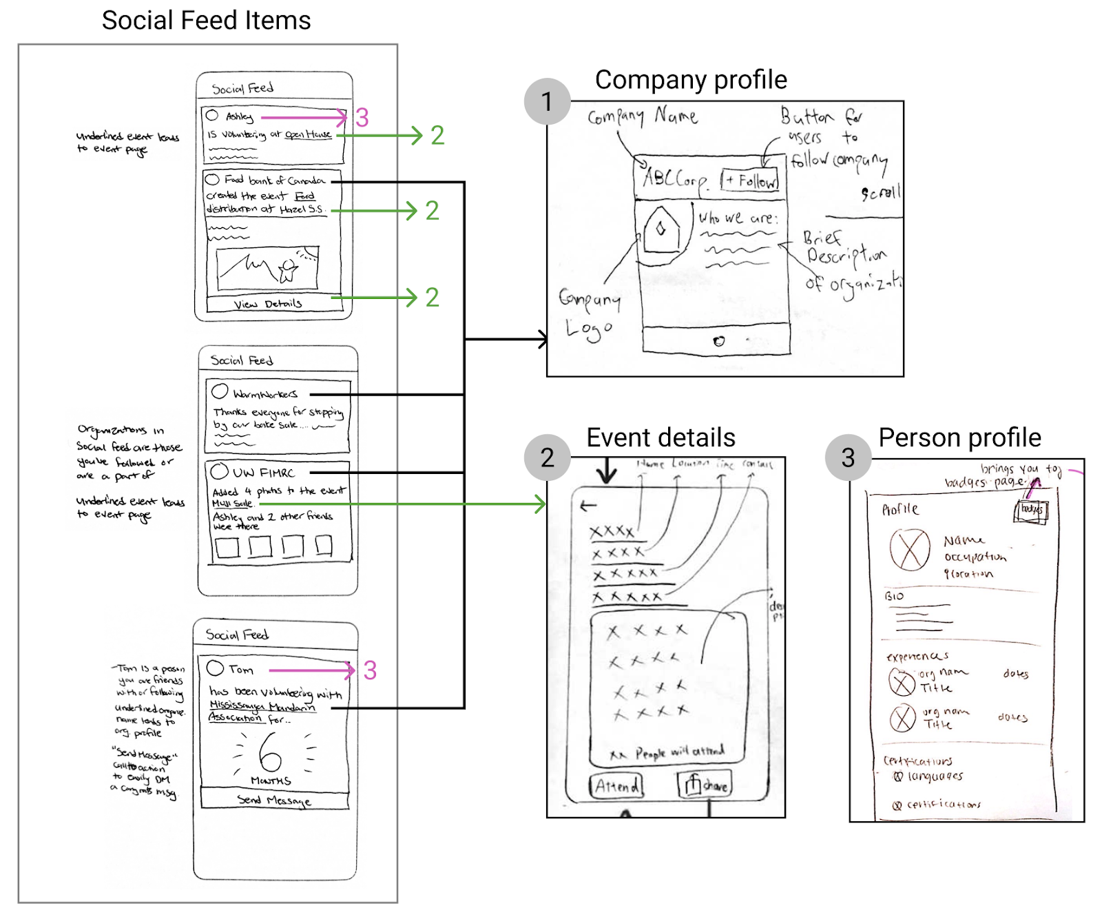
The social feed mirrors the homepage feed of websites like Linkedin or Facebook. It gives an overview of everything that is going on, from both organizations, friends, and people you follow. It keeps users engaged and keeps friends connected to each other by showing updates on what they’re up to. For example, it shows when people register to attend an event in order to encourage their friends to join in as well.
Paper Prototype and Evaluation
We wanted to simulate and test some features that were most important, including the social feed, event listings and search, and sharing. We tried to be creative and have some fun in the process. For example, we used long strips of paper and a device frame to simulate scrolling, letting us easily create longer screens. We also folded paper to create pop out buttons and drop down menus.
Our goal with the paper prototypes was to identify how intuitive our features were to use and understand. We asked our testers to perform various tasks, such as browsing the social feed and finding content on it, searching and signing up for volunteer positions, and checking their medals.
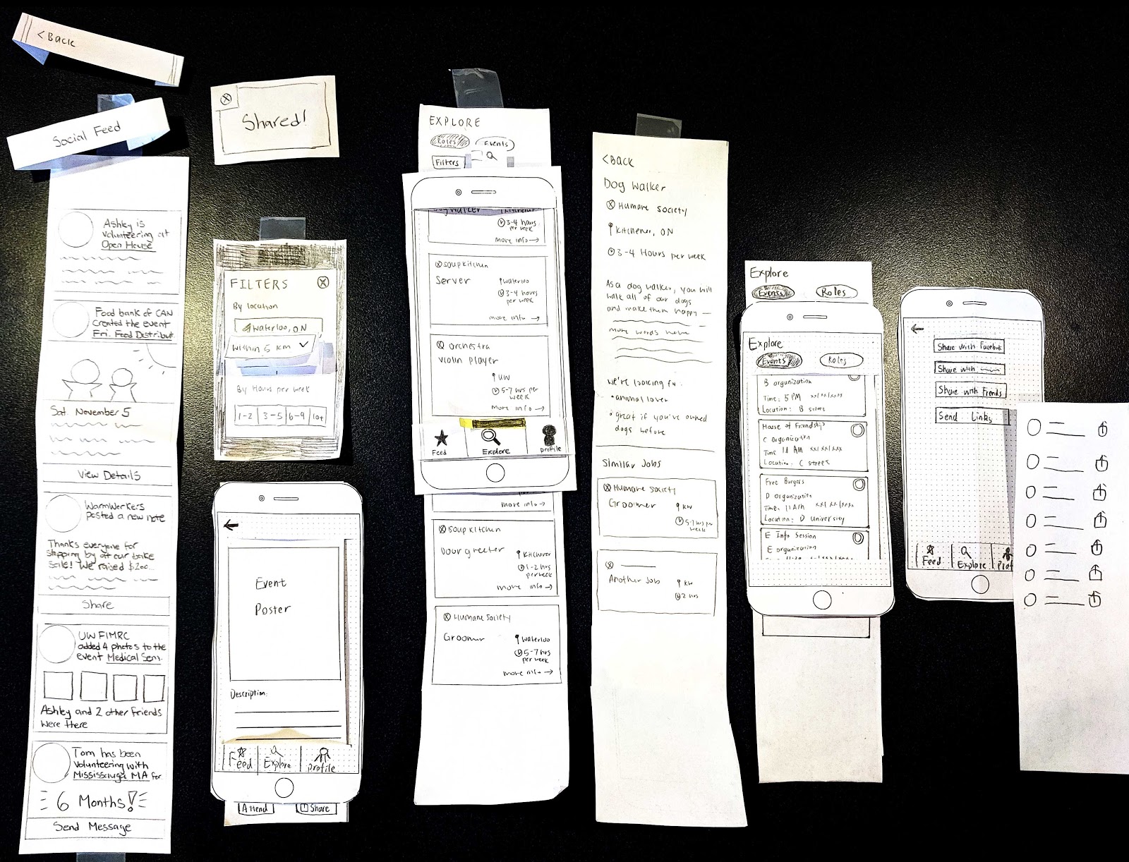
Overall, the results of our evaluation were promising. Testers thought the prototype felt user-friendly and straightforward. They performed most tasks successfully, save for a few issues such as unexpected placement of some features, and nomenclature. The most prominent issue was the confusing surrounding recurring and single-time volunteering roles, which we named "roles" and "events" respectively. This was most likely because people envisioned events also containing roles, rather than a strict distinction. Some of the problems may be caused by the low fidelity design's missing colours and detail. Overall, these evaluations provided us with constructive feedback and directions for future improvements.
Design Iteration
In response to the results from our paper prototype evaluation, we performed a few changes.
Categorizing opportunities & simplifying filtering
We iterated through different designs to explore ways that volunteering opportunities can be presented to users in hopes of solving the confusing between recurring and single-time volunteering opportunities.
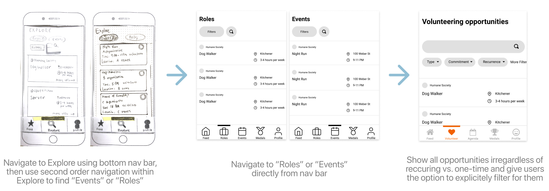
At first, we had a single tab for the volunteering page, where recurring and single-time roles were separated using a selector at the top of the screen. Since through testing, people were confused about the distinction between the two types of roles and the purpose of the selector, we decided to list them directly as separate tabs in the bottom tab bar. While this made clear that there is a distinction between the two volunteering types, users were still unsure about what the difference actually was. Finally, we decided to combine both types under one tab with extended filtering features that describes the nomenclature.
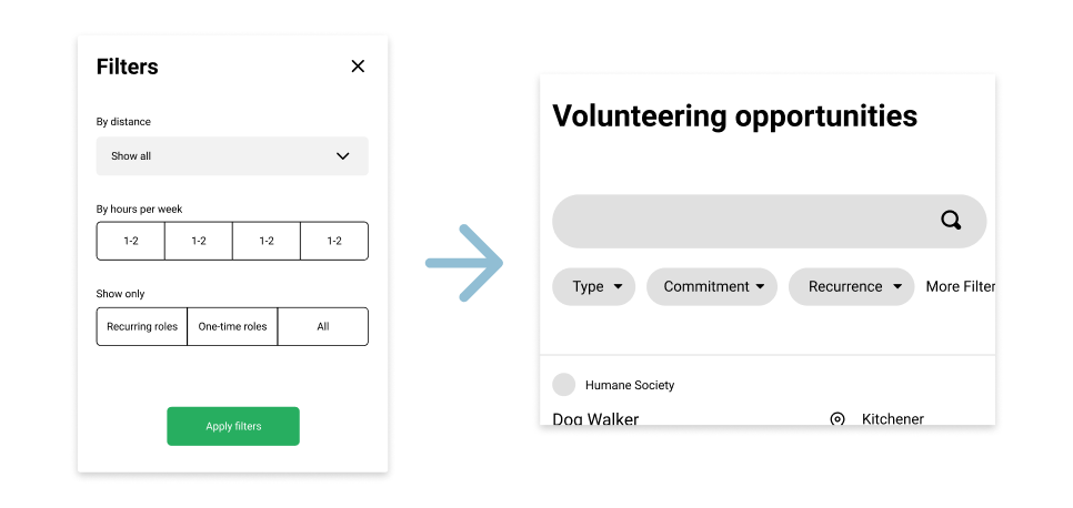
We also decided to surface some filtering options outside the filtering modal to make it easier to set filters and to see which filters are currently set. This also helps with making the two volunteering types clear, as the type selector is the first surface filtering option.
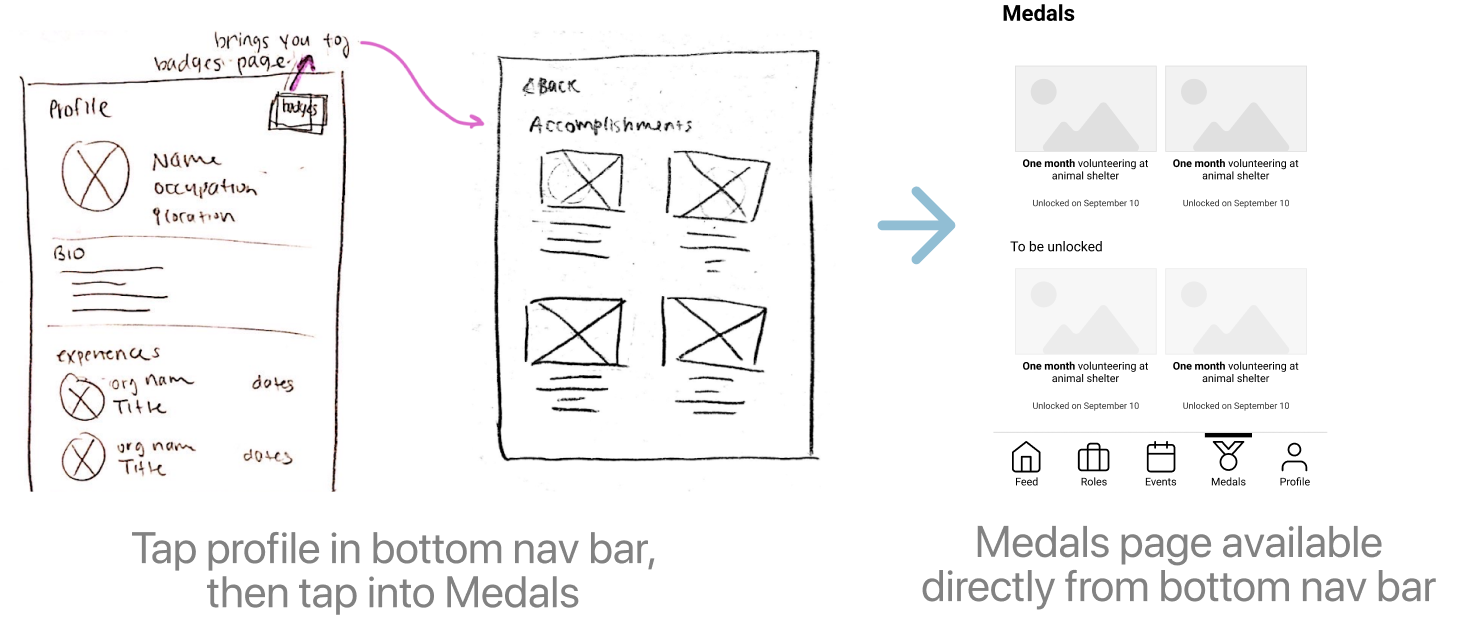
Surfacing medals
We also made medals a more prominent feature rather than embedding it under the user profile. We added a preview of the upcoming medals that can be unlocked to further encourage students to volunteer.
Agenda feature
Finally, we also added an agenda feature to help users keep track of their upcoming commitments.
High Fidelity Prototypes and Evaluation
While paper prototypes were very useful in testing our major design concepts and decisions, our goal for the high fidelity prototypes was to test our more intricate design decisions, such as the colour scheme and design of UI components.
In terms of colour theory and the use of colour, we chose our primary colour to be orange, which invokes a sense of cheerfulness, friendliness and trustworthiness. As for our iconography, we chose a more rounded icon design which encourages users to interact with our app more (than icons with sharp corners and edges).
Heuristics tests
The four heuristics that we tested for are:
- Visibility of system status
- Match between system and real world
- Flexibility and efficiency of use
- Aesthetic and minimalist design
We chose these heuristics because we believed that these four would be the most critical in accomplishing our overall goal – engaging volunteers. We’ll go into more detail for each heuristic below.
1. Visibility of system status
We decided to test for this heuristic because our app deals with a lot of interactive data – for instance, on the social feed, users can interact with the data on the feed by sharing it. We wanted to ensure that our UI reflected user interactions as they expected.
2. Match between system and real world
We want to ensure that our choices of taxonomy and iconography make sense to users, since a lot of it was based on assumptions. Furthermore, based on what each part of the app is named, we want to ensure that are able to see what they had expected to see.
3. Flexibility and efficiency of use
One of our primary goals is to facilitate the networking between organizations and volunteers. In order to achieve this, we must be efficient in communicating the info and allowing users to perform the tasks needed to achieve the tasks they want to perform.
4. Aesthetic and minimalist design
Very high-level, since the goal of our app is to "strengthen cultural organizations", we designed our app to be as friendly as possible with our choice of colours, use of images and rounded corners. We depend on the "aesthetic design" heuristic to evoke a sense of community and friendliness to our users. Furthermore, information users want to see should be organized well so that it is easy for users to find exactly what they’re looking for.
Results
Overall, the results of the heuristic evaluation were fairly successful. Only minor changes to be made were identified.
1. Visibility of system status
Bad: No indicator that tells you whether a post has previously been shared or not.
Good: Users were able to easily check that they were confirmed to volunteer at a given event.
2. Match between system and real world
Bad: Icons were sometimes inconsistent with iOS standards; 'achievements' is a more recognizable word compared to 'medals'.
Good: Easy to learn and use since design patterns used are similar to apps already used by testers.
3. Flexibility and efficiency of use
Bad: Order of "Volunteer" and "Feed" on navbar should be swapped.
Good: Call to action is evident on all pages; overall narrative of app is easy to follow.
4. Aesthetic and minimalist design
Bad: Somewhat cluttered due to the abundance of information.
Good: Friendly-feeling app that promotes interaction; consistent aesthetic experience.
Cognitive walkthrough
For the cognitive walkthrough, we prepared a series of tasks for the testers that covered all main features of our app. The tasks are as follows:
- You are exploring the app for the first time, and you want to see organizations and events you can potentially volunteer at
- You notice that you accidentally made a typo in your name; edit it so that your name is spelled properly.
- You see a post that you think that your friends will enjoy. How would you share it with your friends?
- You are very interested in an organization called WarmWorkers. Check to see all of the upcoming events scheduled that you can volunteer for.
- You have some time this weekend to volunteer. Sign up for some positions to volunteer for this weekend
- Now that you have signed up for some events, you want to see a summary of your upcoming events. Check the list of events you have signed up to volunteer for
- You’ve successfully signed up for your first volunteering gig and earned a new medal! How would you see the other volunteering medals that you could earn by being more and more involved in your community?
- You realize that you have a lot of homework and now will be unable to attend one of your volunteering positions. How would you cancel your attendance?
Results
For the most part, our testers expressed that our app was easy to use. However, there were two main difficulties that our testers had while using the app. First, when asked to sign up for positions to volunteer at this weekend, the tester correctly went into "Volunteer" tab but thought that the events under "This Week" were things that the tester had already signed up for. Furthermore, another tester mentioned that in the events screen, they can’t see which of their friends are volunteering, an info which is displayed on the previous screen.
Changes
Based on our feedback from both the heuristic tests and cognitive walkthrough, we decided to make the following changes:
1. Iconography changes
To meet user expectations regarding iconography, we decided to change the icons used in two contexts to make their action more clear.
Share button: we decided to use the icon that more accurately reflects iOS iconography as opposed to the share icon as seen on Facebook.
Agenda button: the hamburger menu icon that used to be at the top was meant to bring up a larger date picker; however this icon used did not accurately reflect this action, so we decided to change it to a calendar icon.
2. Contextual share button
To make whether or not a user has shared an item with their friends before, we decided to disable the "Share" button if they have already shared it.

Although we got more feedback, we decided not to change our prototype based on all of them, since we felt that the results were somewhat skewed due to testers not having more time to become familiar with the app.
Closing Thoughts
Throughout each step of the design process, we made new discoveries that allowed us to better tailor our product for both aspiring volunteers and organizations. However, since it was much easier to reach young adults for their input, that demographic is the one that we engaged with the most in the process. We were able to achieve a good understanding of the needs of that user group and refine features tailored to them as a result. The same couldn't be said for organizations, which ended up taking a back seat in the design process.
While we had a good understanding of our user group of young adults, we were still lacking information about what influences their decision in choosing where to volunteer. We made a lot of assumptions about what information to show, and in what order, in the Volunteer page. In the future, we would expand on our areas of research through our interviews, and put more effort into continuously engaging representatives from organizations as well. There were also features we discussed earlier on in the design process but didn’t have time to include. For instance, the feature we highlighted was the ability to allow users to print out a certificate of their volunteering involvement. This would have added a lot of value for certain users, especially those in high school needing verified volunteering hours. We should have focused more on this feature in retrospect.
While we felt short in some areas of the design process, we still felt that we achieved our original mission of fostering a community for volunteering and minimizing the friction for young adults to get involved. Even for us personally, having an app like this when we were starting undergrad would have been invaluable.